Flat Illustration using ChatGPT looks easy, but getting consistent results is not.
Most prompts produce random images that cannot be used for blogs, social media, or serious content.
This guide fixes that problem. It explains the generation of flat Illustrations in a clear, step-by-step system anyone can follow.
You will learn how to write better prompts, control style and mood, and create images that look intentional, consistent, and publish-ready without design skills or trial-and-error.
1. What Flat Illustration Using ChatGPT Really Is
Making flat illustrations/images using ChatGPT means creating vector-type 2D flat images by writing text descriptions utilising the AI tool ChatGPT.
You do not draw anything.
You do not need design software.
You simply describe what you want, and ChatGPT generates an image for you.
This changes how creators work.
Writers can create visuals.
Bloggers can design headers.
Creators can test ideas visually without waiting for designers.
Image generation is not magic.
It is a tool.
When used correctly, it saves time, improves clarity, and boosts creativity.
1.1 Flat Illustrations are Visual Translation, Not Guesswork
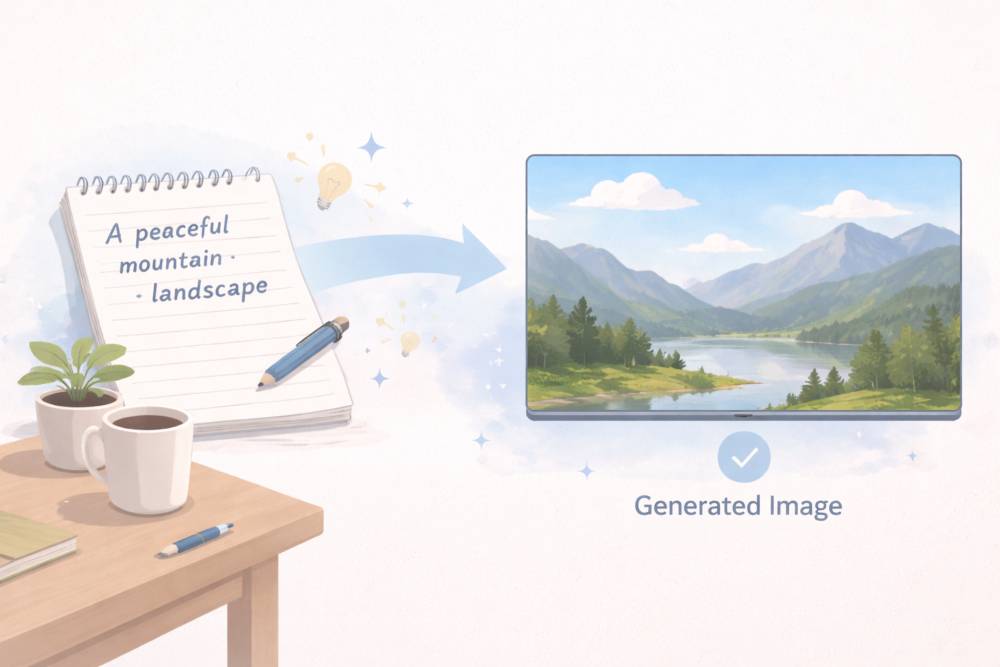
At its core, image generation works like this:
- You write a description
- ChatGPT interprets the description
- An image is created based on patterns it understands
The system does not think like a human artist.
It does not imagine.
It predicts what an image should look like based on your words.
This is why clarity matters more than creativity in prompts.
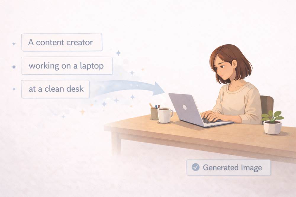
Example
Bad prompt:
“Create something creative.”
Good prompt:
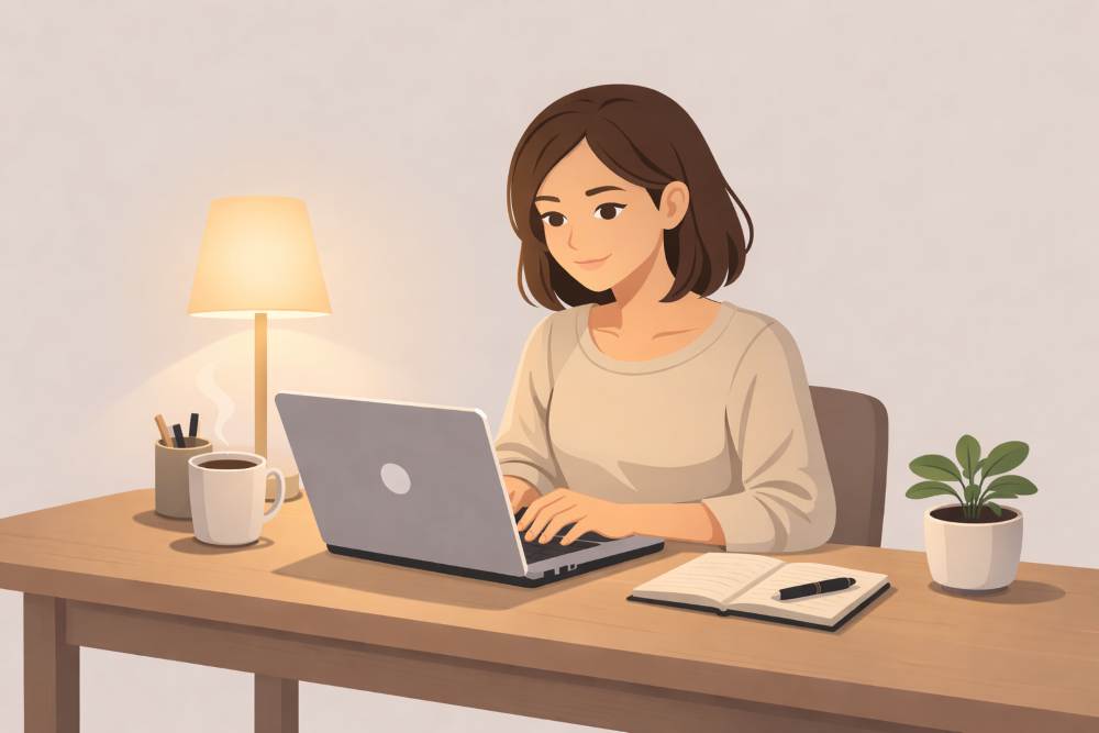
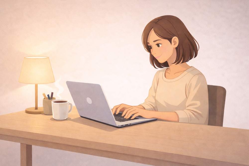
“Create a clean digital illustration of a blogger working on a laptop, soft lighting, calm mood, simple background.”
The second prompt works better because:
- The subject is clear
- The style is defined
- The mood is specified

Good Prompt Example:
“Clean digital illustration of a blogger working on a laptop at a simple desk, neutral colors, soft lighting, calm and focused mood, minimal background, modern flat illustration style.”
1.2 What Flat Illustration using ChatGPT Is Best Used For?
Image generation is best used for supporting content, not replacing reality.
It works extremely well for:
- Blog header images
- Concept illustrations
- Satire visuals
- Explainer images
- Social media creatives
- Thumbnail drafts
It is especially useful when:
- You need an image quickly
- You are testing ideas
- You want consistency in style
Creators often struggle with visuals.
ChatGPT reduces that friction.
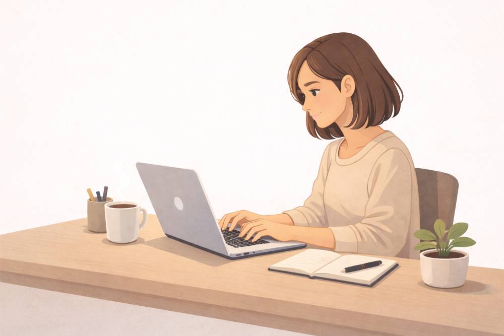
Example use case
A blogger writing about productivity can generate:
- A calm workspace image
- A distracted desk image
- A focused creator image
All using text prompts.
Example prompt
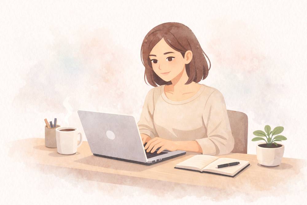
“Wide image of a minimalist workspace with a laptop, notebook, and coffee cup, soft morning light, calm productivity mood.”

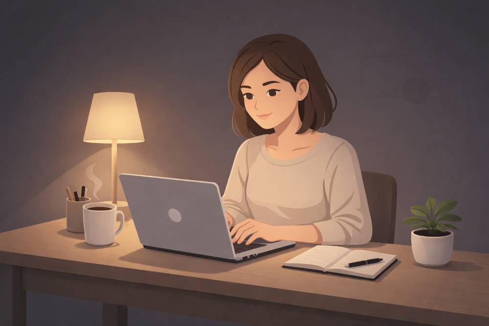
Good Prompt Example:
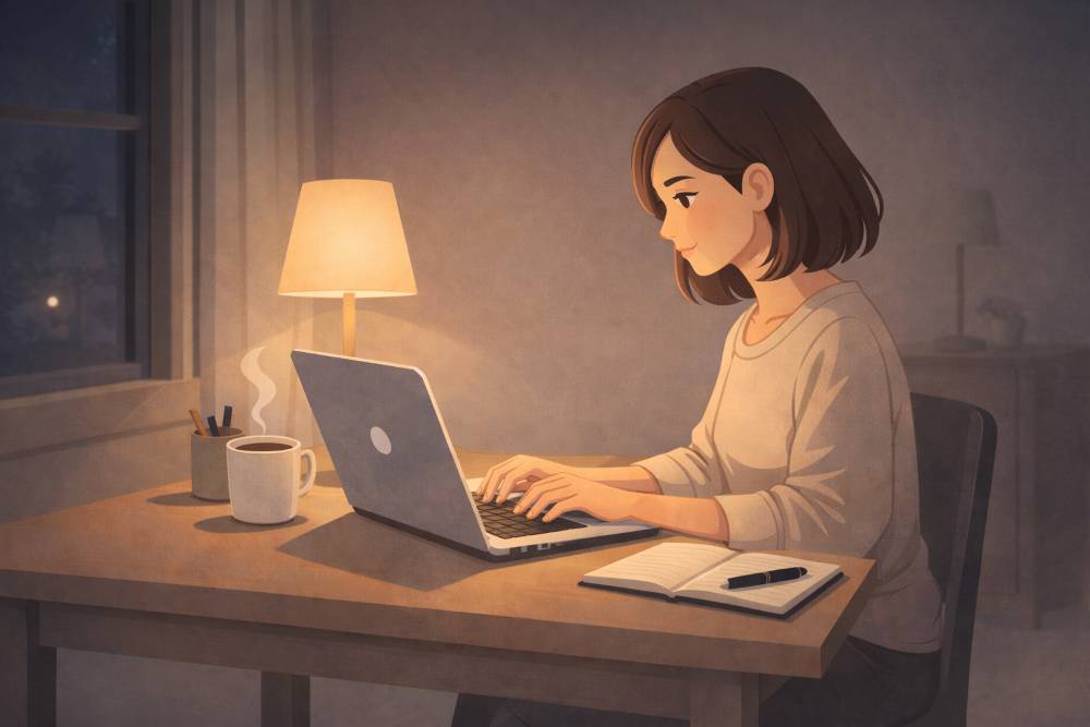
“Flat illustration of a content creator working at night on a laptop, simple desk, dark background, neutral colors, basic lighting, uncluttered composition.”
1.3 What Flat Illustration with ChatGPT Is NOT
This part is critical for beginners.
Flat Illustration using ChatGPT is not:
- A replacement for professional photography
- A tool for exact brand replicas
- A way to copy copyrighted characters
- A guarantee of perfect realism
It will sometimes produce:
- Slightly odd hands
- Inaccurate text inside images
- Faces that feel “almost right”
This is normal.
Understanding limitations prevents frustration.
Common beginner misunderstanding
Many beginners expect:
“Exactly what I imagined in my head.”
What they should expect:
“A strong visual starting point.”
You refine images through iteration, not perfection on the first try.
1.4 Flat Illustration Is a Conversation, Not a Command
One of the biggest advantages of ChatGPT image generation is iteration.
You do not need to get it right in one prompt.
You can:
- Adjust lighting
- Change mood
- Simplify backgrounds
- Improve composition
All by continuing the conversation.
Example workflow
Prompt 1:
“Create a flat illustration of a content creator working at night.”
Prompt 2:
“Make the lighting warmer and the mood more focused.”
Prompt 3:
“Remove background clutter and keep it minimal.”
Each step improves the result.
This makes image generation beginner-friendly.
You are not locked into one result.
1.5 How ChatGPT Understands Style (Simple Explanation)
ChatGPT does not know artists personally.
It understands style through descriptive language.
Style is conveyed by words like:
- minimal
- cinematic
- watercolor
- sketch
- realistic
- flat illustration
You are not naming a painter.
You are describing visual traits.
Example
Instead of saying:
“In the style of a famous artist”
Say:
“Soft watercolor illustration, muted colors, hand-painted feel, gentle brush strokes.”
This keeps your prompts safe and effective.
1.6 Why Beginners Get Generic Images (And How to Avoid It)
Generic images happen for one main reason:
The prompt is too generic.
If you say:
“A man working on a laptop”
You will get:
- A generic person
- A generic desk
- A generic result
To avoid this:
- Add role
- Add mood
- Add environment
Improved prompt
“A freelance writer working on a laptop at a small home desk, soft lamp lighting, quiet night atmosphere, focused expression.”
1.7 Flat Illustration for Bloggers and Creators (Realistic Expectations)
For bloggers and creators, image generation should be seen as:
- A creative assistant
- A visual brainstorming tool
- A consistency engine
It is not about artistic ego.
It is about communication.
If an image:
- Supports your article
- Matches your tone
- Improves reader engagement
Then it has done its job.
Perfect realism is optional.
Clarity is mandatory.
1.8 Where This Fits in a Blog Workflow
A typical blog workflow with image generation looks like this:
- Write the article outline.
- Identify where visuals are needed.
- Generate images using ChatGPT.
- Refine images for tone and style.
- Place images strategically in the post.

This saves time and removes dependency on stock image sites.
1.9 The Right Mindset for Using Flat Illustrations
The most important thing beginners need is the right mindset.
Do not ask:
“Is this image perfect?”
Ask:
“Does this image communicate my idea?”
Do not fight the tool.
Guide it.
When you treat image generation as:
- Collaborative
- Iterative
- Purpose-driven
You get far better results.
1.10 Key Takeaways from This Section
- Image generation is text-to-visual translation
- Clear prompts beat clever prompts
- Iteration is expected
- Limitations are normal
- For creators, usefulness matters more than realism

This foundation is essential.
Every advanced technique builds on this understanding.
2. How Flat Illustrations using ChatGPT Work (A Simple Explanation)
Many beginners think Flat Illustration is complicated.
It is not.
You do not need to understand AI.
You only need to understand how your words are interpreted.
This section explains the process in plain language.
No technical jargon.
No guesswork.
2.1 The Core Idea: Text Goes In, Image Comes Out
Flat Illustration using ChatGPT follows a simple flow:
- You write a text description
- The system analyzes the description
- A visual interpretation is generated
That is it.
There is no hidden creativity button.
There is no imagination like a human artist.
There are only interpretations based on patterns.
This is why your choice of words matters more than length.
Example
Prompt:
“A desk.”
Result:
- Very basic
- No mood
- No personality
Improved prompt:
“A clean desk with a laptop and notebook, soft natural light, calm work atmosphere.”

Result?
- Clear setting
- Better composition
- More useful image
2.2 How ChatGPT Reads Your Prompt (Beginner Logic)
ChatGPT does not read prompts like humans do.
It breaks them into signals.
Think of your prompt as a list of instructions, not a sentence.
These are the signals it looks for:
- Subject (who or what)
- Style (illustration, realistic, minimal)
- Environment (room, outdoors, studio)
- Lighting (soft, dark, dramatic)
- Mood (calm, energetic, serious)
If a signal is missing, the result becomes generic.
Example
Prompt:
“A person writing.”
Missing:
- Where
- How
- What mood
Improved:
“A writer typing on a laptop in a quiet room, soft lamp lighting, focused mood.”
Now the system has enough information to work with.
2.3 Why Order and Clarity Matter
Order helps reduce confusion.
While ChatGPT can understand flexible language, beginners get better results by following a logical order:
- Subject
- Style
- Environment
- Lighting
- Mood
Example (clear order)
“A freelance writer, flat illustration style, small home office, warm desk lamp lighting, calm and focused mood.”
This structure avoids:
- Random elements
- Visual clutter
- Style confusion
2.4 How Much Detail Is “Enough”?
This is where beginners often struggle.
Too little detail:
- Generic images
- Stock-photo look
Too much detail:
- Confused results
- Visual overload
The goal is balanced detail.
A good rule for Beginners
- 1 clear subject
- 1 clear style
- 2–3 descriptive details
Balanced prompt example
“A content creator working on a laptop, digital illustration style, clean desk, soft natural light, minimal background.”
That is enough.
2.5 How the First Image Is Usually a Draft
This is important to understand.
The first generated image is rarely the final image.
Treat it as:
- A sketch
- A draft
- A visual direction
Creators who get the best results never stop at the first output.
They refine.
Common first-image issues
- Lighting feels wrong
- Background is too busy
- Mood does not match the article
This is normal.
2.6 Refinement Is Part of the Process
Refinement means adjusting one thing at a time.
Do not rewrite the entire prompt.
Change only what needs improvement.
Example Refinement steps
Initial prompt:
“A blogger working on a laptop, illustration style.”
Refinement 1:
“Make the lighting warmer and more focused.”
Refinement 2:
“Remove background clutter and keep the desk minimal.”
Refinement 3:
“Adjust mood to feel calm and thoughtful.”
Each step improves clarity.


2.7 Why Flat Illustration Feels Random Sometimes
Beginners often say:
“It feels random.”
It is not random.
It is underspecified.
If the prompt does not clearly say:
- What matters most
- What should be ignored
The system fills gaps on its own.
This is why you should:
- Specify mood
- Specify background simplicity
- Specify focus
Example
Unclear:
“A creative workspace.”
Clear:
“A creative workspace focused on writing, laptop centered, simple desk, no distractions.”

2.8 Flat Illustration is Probabilistic, Not Precise
This is a mindset shift.
ChatGPT does not aim for:
“Exact reproduction”
It aims for:
“Most likely visual interpretation”
That means:
- Two generations of the same prompt can differ
- Small wording changes can cause visible changes
This is a feature, not a bug.
It allows exploration.
2.9 How This Helps Creators Think Visually
For bloggers and creators, this process trains a new skill:
visual thinking.
You start asking:
- What mood does this article have?
- Should this feel calm or energetic?
- Do I want minimal or detailed visuals?
Flat Illustrations force clarity.
That clarity improves:
- Articles
- Social posts
- Brand consistency

2.10 Common Beginner Errors in Understanding the Process
Avoid these mistakes:
- Expecting perfection on the first try
- Changing everything at once
- Ignoring lighting and mood
- Writing poetic prompts instead of descriptive ones
Simple language works better than fancy language.
2.11 Key Takeaways from Section 2
- Image generation follows a simple text → image flow
- Clear signals matter more than long prompts
- The first image is a draft
- Refinement is expected
- Thinking visually improves content quality
Once you understand this process, everything else becomes easier.
3. The Basic Prompt Formula (Use This Every Time)
Most beginners struggle with Flat Illustration for one reason.
They do not know what to include in a prompt.
This section solves that problem.
You will learn a simple prompt formula.
You can reuse it for blogs, social posts, thumbnails, and illustrations.
Once you understand this, generating flat Illustrations is predictable.
3.1 Why You Need a Prompt Formula
Without a formula, prompts become:
- Random
- Overloaded
- Inconsistent
A formula gives you:
- Control
- Repeatable results
- Cleaner images
Think of it like writing an article outline.
You would not start without structure.
Image prompts are the same.
3.2 The 6 Core Elements of a Good Prompt
Every good image prompt contains these six elements:
- Subject – What or who is in the image
- Style – How the image should look
- Composition – Framing and camera view
- Lighting – Light source and intensity
- Mood – Emotional tone
- Background – Environment and simplicity
You do not need fancy words.
You need clear words.
3.3 Element 1: Subject (Never Skip This)
The subject is the most important part.
If the subject is unclear, everything else fails.
Bad subject:
“Something creative”
Good subject:
“A content creator working on a laptop”
Better subject:
“A freelance writer working on a laptop at a small desk”
Always answer this question:
What should the viewer notice first?
3.4 Element 2: Style (Define the Visual Language)
Style tells ChatGPT how to draw, not what to draw.
Common beginner-friendly styles:
- Digital illustration
- Flat illustration
- Minimal vector
- Watercolor
- Cinematic photo style
Avoid mixing too many styles.
Bad:
“Watercolor realistic cinematic sketch illustration”
Good:
“Flat digital illustration”
Clear style = clean output.
Example
“A freelance writer working on a laptop, flat digital illustration style.”
3.5 Element 3: Composition (How the Image Is Framed)
Composition controls:
- Zoom level
- Angle
- Focus
Most beginners forget this.
That leads to awkward framing.
Common composition words:
- Close-up
- Waist-up
- Full-body
- Wide shot
- Centered subject
Example
“Waist-up view of a content creator working on a laptop.”
3.6 Element 4: Lighting (Controls Quality More Than You Think)
Lighting changes everything.
Even simple images look professional with good lighting.
Common lighting descriptions:
- Soft natural light
- Warm desk lamp
- Morning sunlight
- Low contrast lighting
Bad:
“Normal lighting”
Good:
“Soft warm desk lamp lighting”
Example
“Soft warm desk lamp lighting, gentle shadows.”

3.7 Element 5: Mood (Emotion Guides Style)
Mood controls how the image feels.
This is critical for blogs and storytelling.
Common moods:
- Calm
- Focused
- Inspirational
- Serious
- Creative
Mood must match the article.
Example
“Calm and focused mood.”
Avoid emotional contradictions:
- “Calm chaotic energy”
- “Dark cheerful mood”
Pick one.
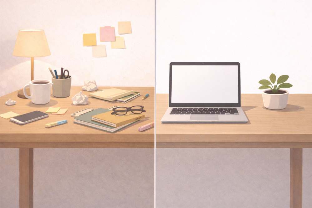
3.8 Element 6: Background (Keep It Simple)
Background decides whether an image feels:
- Clean
- Distracting
Beginners should always prefer:
- Simple background
- Minimal environment
Bad:
“Detailed background with many objects”
Good:
“Clean minimal background with no distractions”
Example
“Clean minimal background, no clutter.”
3.9 The Complete Prompt Formula (Put Together)
Here is the full structure:
Subject + Style + Composition + Lighting + Mood + Background
Complete example
“A freelance writer working on a laptop, flat digital illustration style, waist-up view, soft warm desk lamp lighting, calm and focused mood, clean minimal background.”
This formula works across:
- Blog images
- Social media visuals
- Thumbnails
- Concept art
3.10 Start Simple, Then Improve
Do not try to write the perfect prompt on the first attempt.
Use this process:
- Write a basic prompt
- Generate the image
- Improve one element
- Regenerate
Example
- First fix lighting
- Then fix background
- Then adjust mood
This avoids confusion.
3.11 Common Beginner Mistakes in Prompt Writing
Avoid these errors:
- Writing long poetic sentences
- Adding too many styles
- Forgetting lighting
- Ignoring background
- Changing all elements at once
Clear beats clever.
3.12 Key Takeaways from Section 3
- Every good prompt follows a structure
- Subject and style are mandatory
- Lighting and mood improve the quality
- Simple backgrounds work best
- One change at a time gives better results
Once this formula becomes a habit, the flat Illustration image stops feeling random.
4. Writing Your First Good Prompt (Step by Step)
Most beginners fail at Flat Illustration because they try to do too much at once.
They imagine a perfect image in their head.
Then they try to describe everything in one sentence.
That never works.
The correct approach is simple:
- Start small
- Add clarity
- Improve step by step
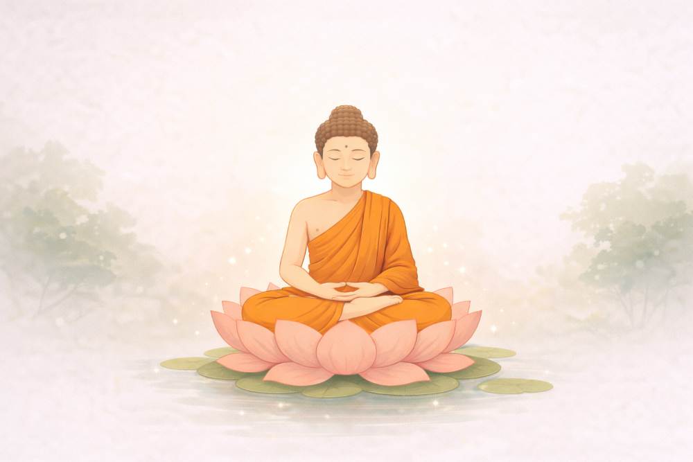
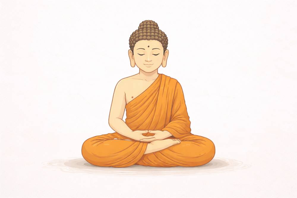
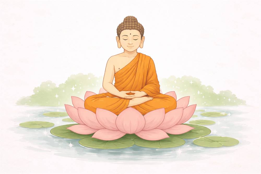
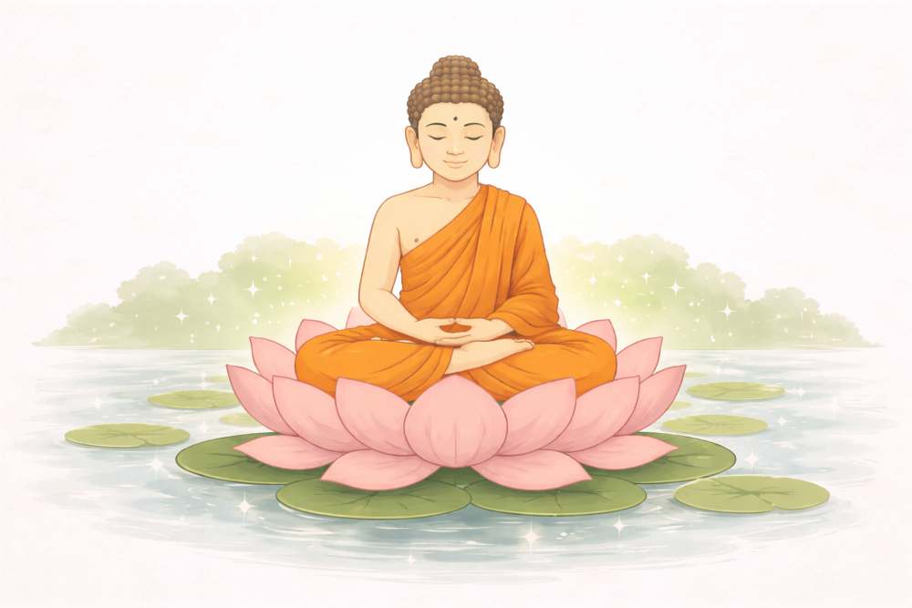
In this section, you will learn how to write your first good prompt using a Buddha and meditation illustration theme.
4.1 Start With One Clear Idea Only
Your first prompt should express one idea.
Not a scene.
Not a philosophy.
Not symbolism.
Just one idea.
Bad prompt:
“A deeply spiritual Buddha meditation scene representing peace, wisdom, enlightenment, cosmic balance, and inner awakening.”
Too much.
The result will be confused.
Good prompt:
“A Buddha sitting in meditation.”
That is enough to start.
4.2 Add a Style (Do Not Skip This)
Without a style, the image will look generic.
Style tells ChatGPT how to draw, not what to believe.
Beginner-friendly styles for meditation visuals:
- Flat illustration
- Minimal digital illustration
- Watercolor style
- Soft painterly illustration
Avoid mixing styles.
Bad:
“Realistic flat watercolor cinematic style”
Good:
“Minimal flat digital illustration”
Improved prompt
“A Buddha sitting in meditation, minimal flat digital illustration style.”
4.3 Add Environment Slowly
Do not describe the universe.
Describe the immediate environment.
Beginner mistake:
“Surrounded by cosmic energy and infinite space”
Better:
“Sitting on a lotus flower”
Even better:
“Sitting on a lotus flower, simple nature setting”
Prompt example
“A Buddha sitting in meditation on a lotus flower, minimal flat digital illustration style.”
4.4 Add Lighting to Control the Feeling
Lighting controls emotion more than color.
For meditation imagery, good lighting words are:
- Soft light
- Gentle glow
- Warm ambient light
- Diffused lighting
Avoid harsh or dramatic lighting.
Bad:
“Strong contrast dramatic lighting”
Good:
“Soft gentle ambient lighting”
Prompt example
“Soft gentle ambient lighting around the Buddha.”
4.5 Add Mood (This Is Critical for Spiritual Themes)
Mood defines the emotional impact.
For meditation visuals, suitable moods are:
- Calm
- Peaceful
- Serene
- Still
- Centered
Never mix moods.
Bad:
“Peaceful energetic intense mood”
Good:
“Calm and serene mood”
Prompt example
“Calm and serene mood, peaceful atmosphere.”
4.6 Control the Background (Less Is More)
Beginners often overdecorate backgrounds.
For spiritual visuals:
- Simple backgrounds work best
- Negative space increases impact
Bad:
“Highly detailed temple with many elements”
Good:
“Clean minimal background with subtle nature elements”
Prompt example
“Clean minimal background with subtle nature elements, no clutter.”
4.7 The First Complete Beginner Prompt (Buddha Theme)
Now we combine everything.
Complete beginner prompt
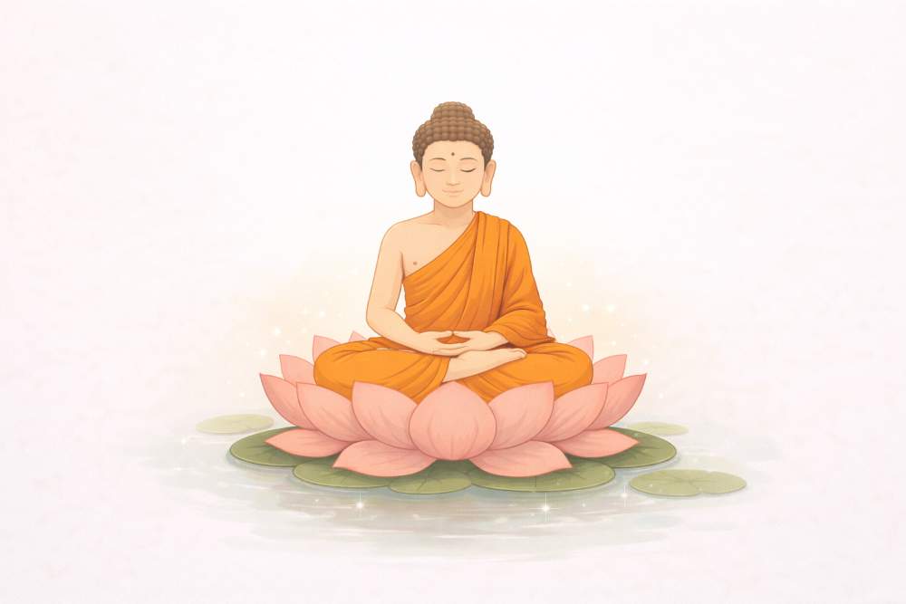
“A Buddha sitting in meditation on a lotus flower, minimal flat digital illustration style, centered composition, soft gentle ambient lighting, calm and serene mood, clean minimal background.”
This is a good first prompt.
Not perfect.
But clear and usable.
4.8 Improve One Thing at a Time (Very Important)
Do not rewrite the entire prompt.
Change only one element per iteration.
Example refinement flow
Base prompt:
“A Buddha sitting in meditation on a lotus flower, minimal flat digital illustration style.”
Refinement 1 (lighting):
“Make the lighting softer and more diffused.”
Refinement 2 (background):
“Simplify the background further and remove all distractions.”
Refinement 3 (mood):
“Increase the sense of calm and stillness.”
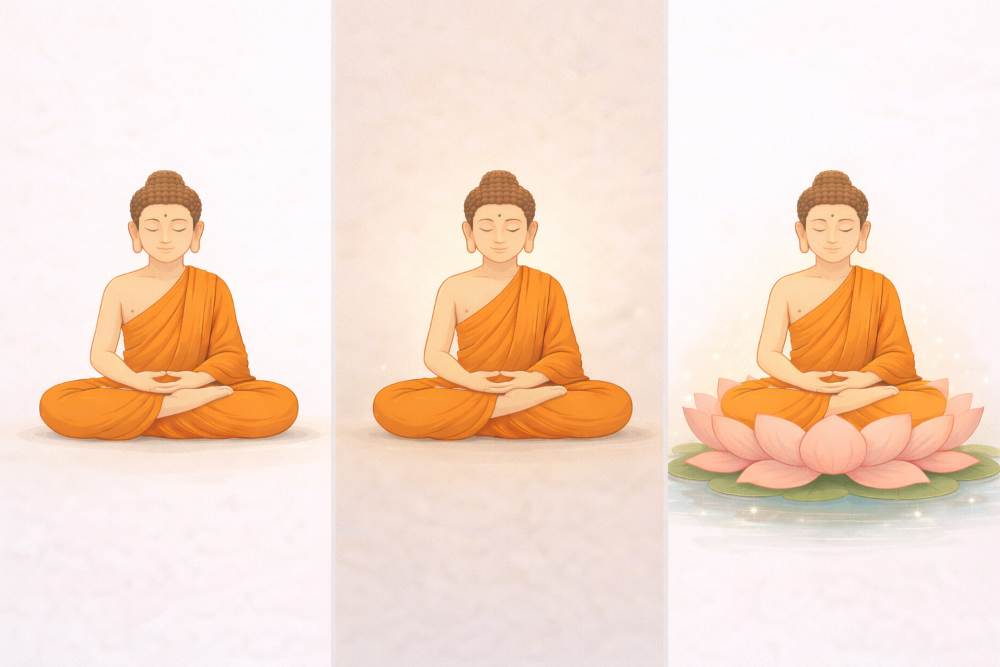
This approach gives control.
4.9 Common Beginner Mistakes (Buddha & Spiritual Images)
Avoid these mistakes:
- Over-symbolism
- Too many spiritual concepts in one image
- Dramatic lighting that breaks calm
- Crowded temples and backgrounds
- Mixing multiple art styles
Spiritual visuals need restraint.
4.10 Why This Method Works for Any Subject
Even though this section uses Buddha and meditation, the method is universal.
You can replace:
- “Buddha” → any subject
- “Meditation” → any theme
The structure stays the same.
That is the real lesson.
4.11 Key Takeaways from Section 4
- Start with one clear idea
- Add style before details
- Build prompts step by step
- Improve one element at a time
- Simplicity creates stronger spiritual visuals
Once you master this, your prompts stop feeling chaotic.
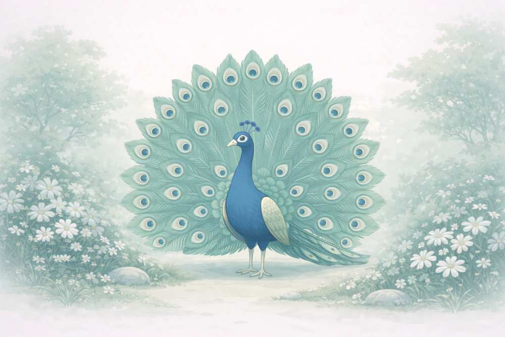
5. Using Styles Without Confusion (Peacock & Aesthetic Garden Theme)
Most beginners think styles are complicated.
They are not.
Confusion happens because people:
- Mix too many styles
- Use vague style words
- Change style every time
This section teaches you how to use styles correctly, using peacocks in an aesthetic garden as visual examples.
5.1 What Style Really Means in Flat Illustration?
Style answers one question:
How should the image look?
It does NOT mean:
- Philosophy
- Symbolism
- Emotion
Those come later.
Style controls:
- Line quality
- Color treatment
- Detail level
- Overall visual language
If the style is unclear, the image becomes inconsistent.
5.2 Why Beginners Get Style Wrong
Beginners often write prompts like this:
“A realistic watercolor flat cinematic illustration of a peacock.”
This fails because:
- Realistic and flat conflict
- Watercolor and cinematic conflict
The system does not know which one to follow.
Rule
👉 One main style per image.
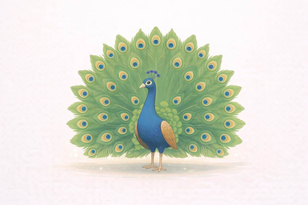
5.3 Choose One Style First (Peacock Example)
Before adding poses or environments, lock the style.
Beginner-friendly styles for aesthetic visuals:
- Flat digital illustration
- Minimal vector illustration
- Soft watercolor illustration
- Painterly digital illustration
Good style-only prompt
“A peacock, flat digital illustration style.”
This creates a visual foundation.
5.4 Add the Environment After Style Is Locked
Once style is clear, add the environment.
Do not describe everything.
Describe only what supports the subject.
For aesthetic garden visuals:
- Soft greenery
- Flowers
- Natural balance
Prompt example
“A peacock in an aesthetic garden, flat digital illustration style.”
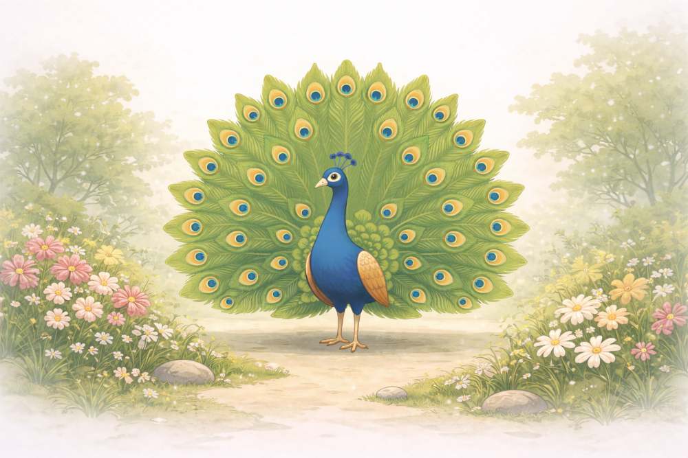
This works because:
- Style is fixed
- Environment is simple
5.5 Using Different Poses Without Changing Style
This is very important for creators.
You can change:
- Pose
- Angle
- Action
Without changing style.
Examples of peacock poses:
- Standing calmly
- Walking through the garden
- Feathers partially open
- Feathers fully spread
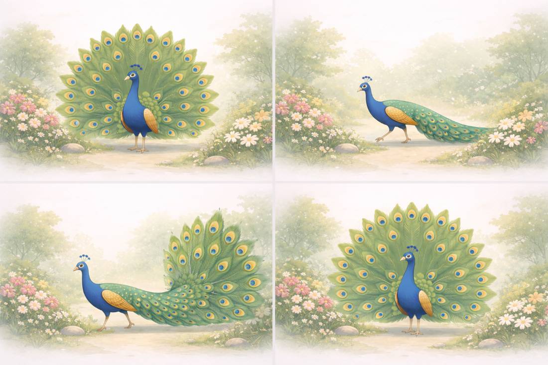
Style stays the same. Pose changes.
Prompt examples
- “Peacock standing calmly in a garden, flat digital illustration style.”
- “Peacock walking through an aesthetic garden, flat digital illustration style.”
- “Peacock with feathers partially open, flat digital illustration style.”
5.6 Why Style Consistency Matters for Blogs and Creators
Consistent style makes your content feel:
- Professional
- Intentional
- Trustworthy
Inconsistent style feels:
- Random
- AI-generated
- Unpolished
If one article uses:
- Flat illustration
And the next uses:
- Hyper-realistic photos
The site loses visual identity.
Style consistency builds brand memory.
5.7 How to Describe Style Clearly (Simple Language)
You do not need advanced art terms.
Simple style descriptors work best:
- Flat
- Minimal
- Soft
- Painterly
- Clean
Good example
“Soft painterly digital illustration with gentle colors.”
Bad example
“Neo-surreal post-modern hyper-detailed art style.”
Simple words give better results.
5.8 Adding Color Without Breaking Style
Color is part of style, not decoration.
For peacock visuals:
- Blues and greens dominate
- Avoid too many accent colors
Prompt example
“Rich blue and green tones, balanced color palette.”
Do not list ten colors.
Two or three is enough.
5.9 Common Style Mistakes (Peacock Examples)
Avoid these mistakes:
- Changing style mid-prompt
- Mixing photo and illustration
- Using trendy buzzwords
- Over-describing textures
Bad:
“Flat realistic peacock photo illustration”
Good:
“Flat digital illustration of a peacock.”
5.10 Style Locking (Advanced Beginner Tip)
Once you find a style you like, reuse it exactly.
Copy the style phrase.
Paste it into future prompts.
Example style lock:
“Flat digital illustration style, clean lines, soft colors, editorial look.”
Reuse this across:
- Blog images
- Social posts
- Thumbnails
This creates visual consistency.
5.11 Why the Peacock Example Matters
The peacock is complex:
- Feathers
- Color
- Shape
If you can keep style consistent with a peacock,
you can do it with any subject.
This makes it a perfect learning example.
5.12 Key Takeaways from Section 5
- Style answers “how it looks”
- Use one main style per image
- Lock style before changing poses
- Simple words work best
- Consistent style builds creator identity
Once style stops confusing you, generating flat illustrations becomes predictable.
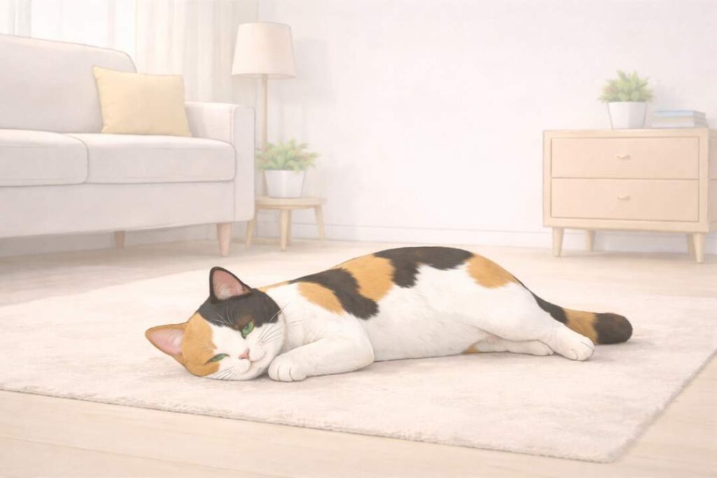
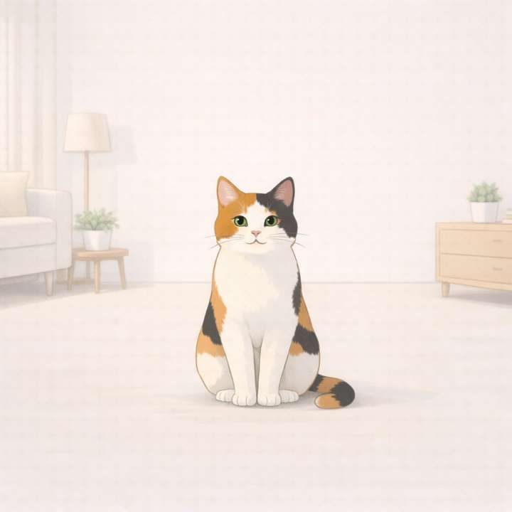
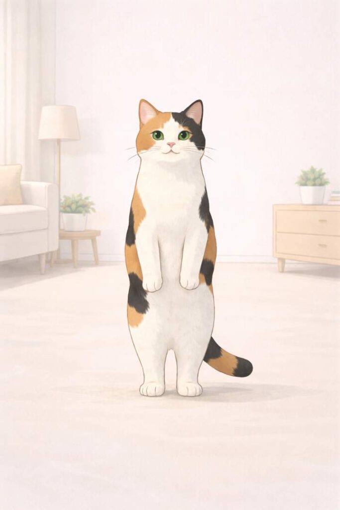
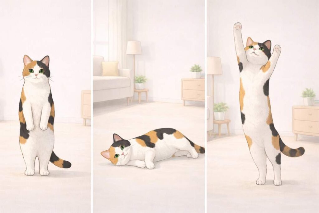
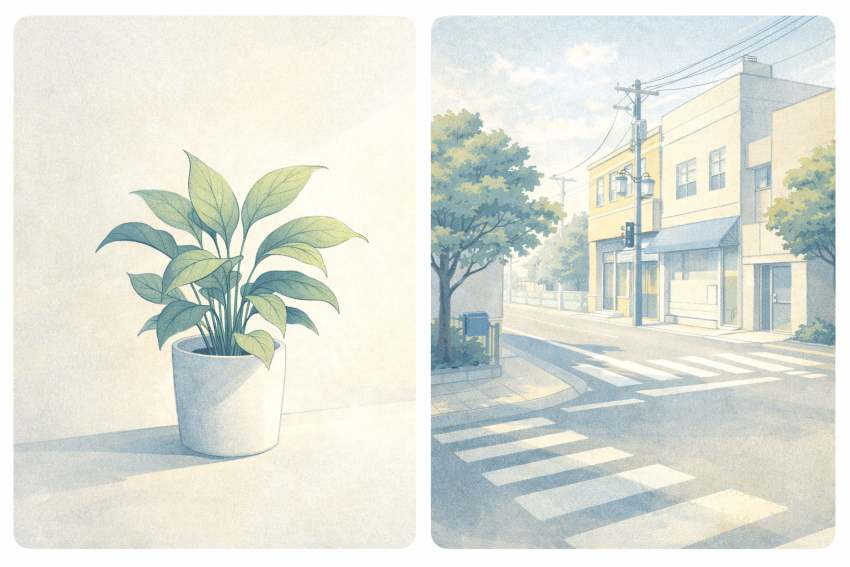
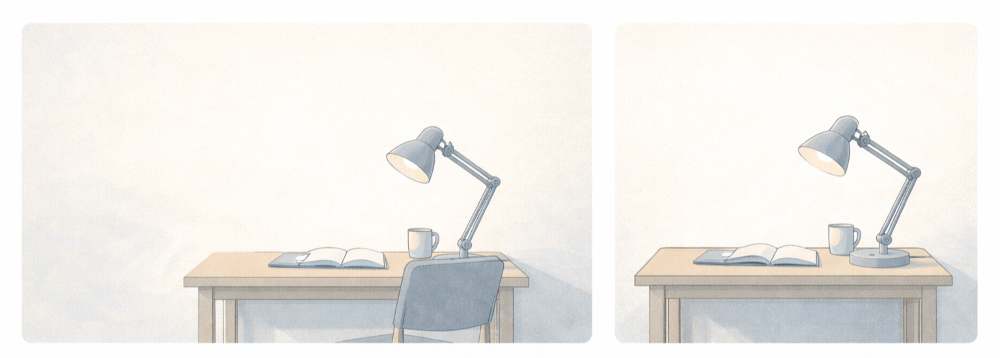
6. Aspect Ratios and Use-Cases (Cute Cat & Clean Room Theme)
Aspect ratio means the shape of the image.
Not the style.
Not the subject.
Only the shape.
Many beginners ignore this.
That is why images look cropped, awkward, or unusable.
This section explains which aspect ratio to use, where to use it, and how the same subject changes with shape, using a cute cat in a clean room as an example.
6.1 What Aspect Ratio Really Means
Aspect ratio is the width-to-height relationship of an image.
Common ratios you will use:
- 16:9 → wide
- 1:1 → square
- 9:16 → vertical
Each ratio has a purpose.
If you use the wrong one, the image still looks “good” but does not fit.
6.2 Why Bloggers and Creators Must Care
Aspect ratio decides:
- Where the image fits
- How much gets cropped
- What stays visible
A blog header needs space on the sides.
A social post needs balance.
A reel needs vertical focus.
Same subject.
Different shape.
Different result.
6.3 Wide Images 16:9 (for Blog Headers)
This is the most important ratio for bloggers.
Use 16:9 for:
- Blog headers
- Featured images
- YouTube thumbnails
The subject should be:
- Centered or slightly off-center
- With empty space on the sides
Cat example
The cat should not fill the frame.
The room should breathe.
Prompt example
“Wide 16:9 illustration of a cute cat sitting calmly in a clean modern room, flat digital illustration style, soft lighting, minimal furniture, calm mood, suitable for a blog header.”
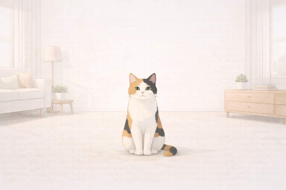
6.4 Square Images 1:1 (for Social Media & Thumbnails)
Square images are balanced.
They work well on:
- X (Twitter)
- Small previews
The subject should be:
- Clearly visible
- Centered
- Not too small
Cat example
The cat can fill more space here.
Details matter more.
Prompt example
“Square 1:1 illustration of a cute cat sitting on the floor in a clean room, flat digital illustration style, centered composition, soft colors, calm and cozy mood.”
6.5 Vertical Images 9:16 (for Reels & Shorts)
Vertical images are for:
- Instagram reels
- YouTube shorts
- Stories
This ratio forces focus.
The subject must be:
- Tall or upright
- Clearly visible from top to bottom
Cat example
The cat can:
- Stand
- Stretch
- Look upward
Avoid wide poses.
Prompt example
“Vertical 9:16 illustration of a cute cat standing upright in a clean room, flat digital illustration style, vertical composition, soft light, minimal background, playful mood.”
6.6 Same Subject, Different Poses (Very Important)
Aspect ratio works best when pose matches shape.
Examples with the same cat:
- Sitting → square
- Relaxing sideways → wide
- Standing or stretching → vertical
You do not change style.
You change pose.
Prompt examples
- “Cute cat sitting calmly in a clean room…”
- “Cute cat lying sideways on the floor in a clean room…”
- “Cute cat standing and stretching in a clean room…”
6.7 Common Beginner Mistakes with Aspect Ratios
Avoid these mistakes:
- Using square images as blog headers
- Letting the subject touch edges
- Forgetting empty space
- Cropping faces or heads
Always decide the ratio before generating the image.
6.8 Simple Rule to Remember
- Blog → 16:9
- Social posts → 1:1
- Reels & shorts → 9:16
Then adjust the pose.
This one rule solves most problems.
6.9 Key Takeaways from Section 6
- Aspect ratio is about shape, not style
- Each platform prefers a different ratio
- Same subject works across ratios with pose changes
- Decide ratio before writing the prompt
- Clean composition beats cropping later
Once you master this, your images stop breaking layouts.
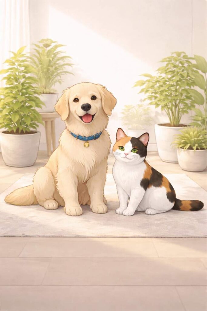
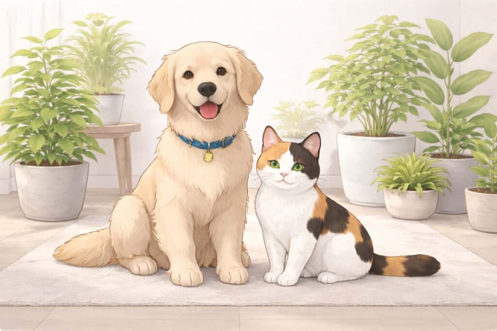
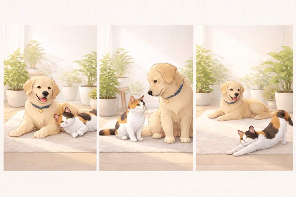
7. Improving Images Through Iteration (Cute Dog, Cat & Modern Indoor Garden)
Most beginners think Flat Illustrations are a one-shot process.
That is the biggest mistake.
Good images are not generated.
They are refined.
Iteration means improving an image step by step instead of starting over every time.
This section shows how to do that clearly, using a cute dog and cat in a modern indoor garden as the visual example.
7.1 What Iteration Really Means
Iteration means:
- Generate
- Observe
- Adjust
- Regenerate
You do not rewrite the whole prompt.
You fix one problem at a time.
This approach gives control.
Without iteration:
- Results feel random
- Images lack polish
With iteration:
- Images feel intentional
- Style stays consistent
7.2 Start With a Simple Base Image
Your first image should be basic.
Do not aim for perfection.
Aim for clarity.
Base prompt example
“A cute dog and cat sitting together in a modern indoor garden, flat digital illustration style, clean background.”
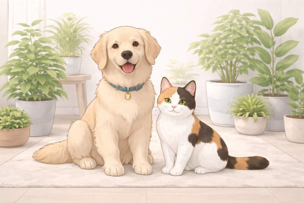
This gives you:
- The right subjects
- A usable environment
- A neutral starting point
7.3 Identify What Is Wrong (Before Changing Anything)
After the first image, pause.
Ask only these questions:
- Is the lighting right?
- Is the mood correct?
- Is the background too busy?
- Is the pose working?
Do not change everything.
Pick one issue.
Example:
- Lighting feels flat
- Mood feels dull
That is enough to proceed.
7.4 Iteration Step 1: Fix Lighting
Lighting is usually the first fix.
Good lighting improves quality fast.
Refinement prompt
“Keep everything the same, but add soft natural indoor lighting with gentle shadows.”
This keeps:
- Same dog and cat
- Same garden
- Same style
Only lighting changes.
7.5 Iteration Step 2: Improve Mood
Once lighting works, adjust the mood.
Mood controls emotion.
For indoor garden scenes, good moods are:
- Calm
- Cozy
- Peaceful
- Playful but gentle
Refinement prompt
“Increase the sense of calm and coziness, make the scene feel peaceful and welcoming.”
Do not touch the style. Do not touch the layout.
7.6 Iteration Step 3: Adjust Poses (Without Breaking Style)
Now you can change poses.
Pose changes keep images fresh without changing identity.
Examples:
- Dog sitting, cat lying
- Dog looking at cat
- Cat stretching, dog relaxed
Refinement prompt
“Change the pose so the dog is sitting calmly while the cat is lying comfortably nearby.”
This adds variety while keeping consistency.
7.7 When to Iterate vs When to Restart
This matters.
Iterate when:
- Subject is correct
- Style looks good
- Only details feel off
Restart when:
- Subject is wrong
- Style is unusable
- Composition completely fails
Restarting too often wastes time.
Iteration saves it.
7.8 One-Change Rule (Golden Rule)
Always follow this rule:
Change only one thing per iteration.
Never change:
- Style
- Subject
- Mood
All at once.
That causes chaos.
Iteration works because it is controlled.
7.9 Common Beginner Iteration Mistakes
Avoid these:
- Rewriting the entire prompt
- Changing style mid-way
- Adding new elements every step
- Over-refining until the image looks artificial
Stop when the image:
- Supports your content
- Looks clean
- Feels intentional
Perfection is not the goal.
Usefulness is.
7.10 Why Iteration Matters for Bloggers and Creators
Iteration helps you:
- Maintain visual consistency
- Build a recognizable style
- Produce better images faster
Creators who iterate look professional.
Creators who regenerate randomly look careless.
This skill separates beginners from confident users.
7.11 Key Takeaways from Section 7
- The first image is a draft
- Identify one problem at a time
- Fix the lighting first
- Adjust the mood second
- Change poses last
- Restart only when necessary
Once you master iteration, Flat Illustration images stop feeling unpredictable.
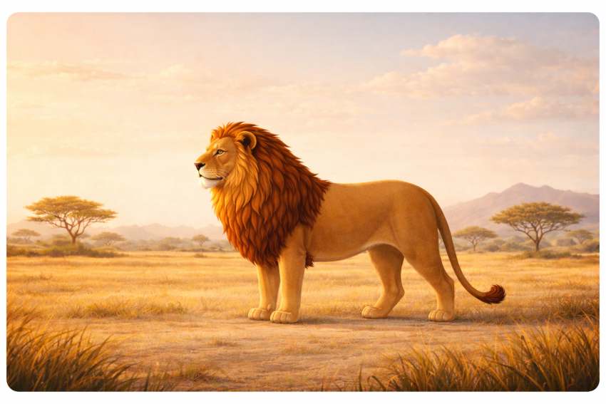
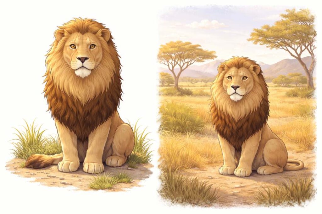
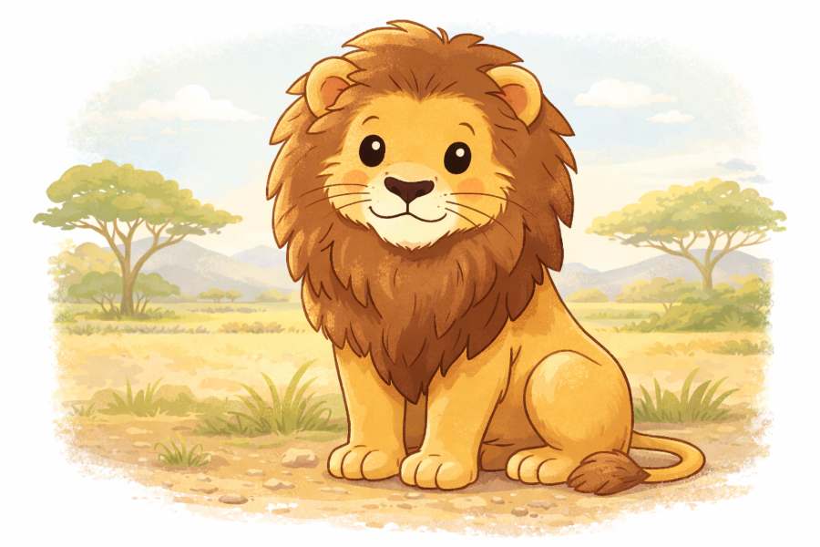
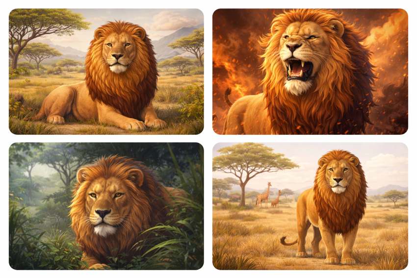
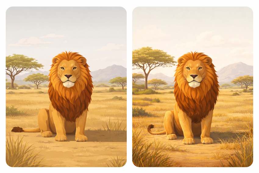
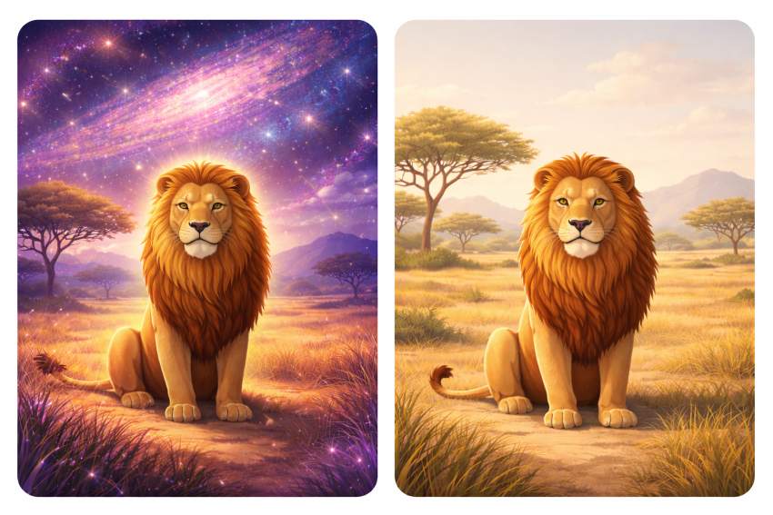
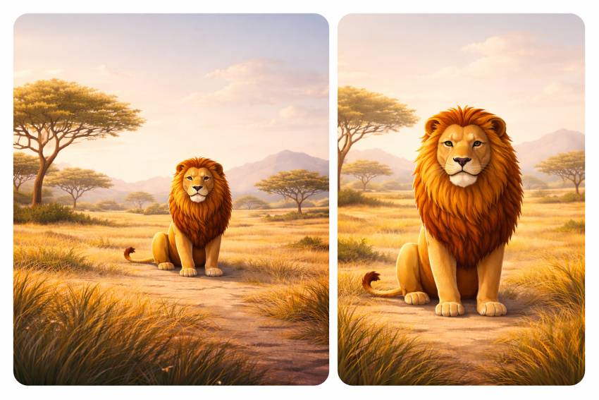
8. Avoiding Common Beginner Mistakes (Cute Lion & Savanna Theme)
Most image problems do not come from the tool.
They come from avoidable beginner mistakes.
This section shows the most common errors.
It also shows how to fix them.
We will use a cute lion in the savanna with different poses, so the lessons are easy to see.
8.1 Mistake #1: Being Too Vague
Vague prompts create generic images.
Bad prompt:
“A lion in nature.”
This gives:
- Random pose
- Random mood
- Random background
Good prompt:
“A cute lion sitting calmly in a savanna, flat digital illustration style, soft warm light, peaceful mood.”
Clarity always wins.
8.2 Mistake #2: Adding Too Many Ideas at Once
Beginners often try to say everything.
Bad prompt:
“A cute lion in the savanna at sunrise with dramatic clouds, flying birds, symbolic elements, cinematic lighting, watercolor flat style.”
This mixes:
- Too many ideas
- Conflicting styles
The result feels messy.
Better approach:
- One subject
- One mood
- One style
Good prompt:
“A cute lion sitting in the savanna at sunrise, flat digital illustration style, soft warm lighting, calm mood.”
8.3 Mistake #3: Mixing Conflicting Styles
This is one of the most common errors.
Bad style mix:
“Realistic flat cartoon cinematic illustration”
These styles fight each other.
Rule:
👉 Use one main style.
Good example:
“Flat digital illustration style.”
Once the image works, you can explore variations later.
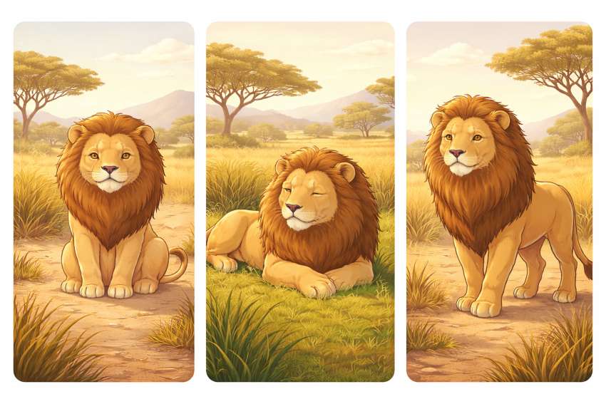
8.4 Mistake #4: Ignoring Pose and Body Language
Pose changes meaning.
A lion standing tall feels:
- Confident
- Alert
A lion lying down feels:
- Calm
- Safe
Beginners often ignore this.
Pose-based prompts
- “Cute lion sitting calmly in the savanna…”
- “Cute lion lying peacefully on grass…”
- “Cute lion standing and looking ahead…”
8.5 Mistake #5: Forgetting Lighting
Lighting controls quality.
Without lighting instructions:
- Images feel flat
- Mood is unclear
Bad:
“Normal lighting”
Good:
“Soft warm savanna sunlight”
Lighting should match the story.
Morning light feels hopeful.
Evening light feels calm.
Harsh light feels dramatic.
Choose intentionally.
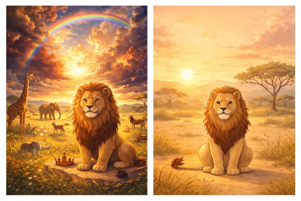
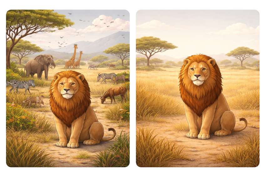
8.6 Mistake #6: Overcrowding the Background
More background does not mean better image.
Bad:
“Savanna with many animals, trees, mountains, clouds, details everywhere”
This distracts from the lion.
Good:
“Open savanna with subtle grass and distant trees”
Simple backgrounds keep focus.
8.7 Mistake #7: Changing Everything During Iteration
Beginners often do this:
- Change style
- Change pose
- Change mood
- Change background
All at once.
Result: chaos.
Correct method:
- Change one thing at a time
Example:
- First fix lighting
- Then fix pose
- Then adjust mood
This keeps control.
8.8 Mistake #8: Expecting Perfection on the First Try
This is a mindset problem.
The first image is a draft.
Always.
Professional-looking images are built through:
- Observation
- Small changes
- Patience
If the lion looks “almost right,” you are on track.
8.9 Mistake #9: Overusing Fancy Words
Big words confuse the system.
Bad:
“Majestic awe-inspiring transcendental lion”
Good:
“Cute lion with a calm and friendly expression”
Simple language works better.
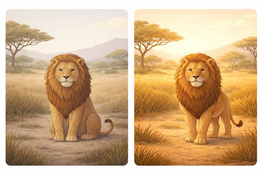
8.10 Mistake #10: Not Matching Image to Purpose
Ask this before generating:
- Is this for a blog header?
- Social media?
- Thumbnail?
A blog header lion should:
- Have space around it
A social post lion should:
- Be centered and clear
Purpose decides composition.
8.11 Quick Fix Checklist (Use This Every Time)
Before generating, check:
- Is the subject clear?
- Is the style single and simple?
- Is the pose intentional?
- Is the lighting defined?
- Is the background clean?
If all answers are “yes,” your prompt is ready.
8.12 Why the Lion Example Works So Well
The lion is expressive:
- Small pose changes matter
- Mood is easy to read
If you can avoid mistakes with a lion,
you can avoid them with any subject.
8.13 Key Takeaways from Section 8
- Most problems come from unclear prompts
- One subject, one style works best
- Pose and lighting matter more than details
- Clean backgrounds improve focus
- Iteration beats perfection
Avoiding these mistakes saves time.
It also makes your images look intentional, not accidental.
9. Brand & Consistency Control (How to Look Intentional, Not Random)
Consistency is the difference between:
- Images that look designed
- Images that look generated
Most beginners ignore this.
That is why their visuals feel random.
This section shows how to control brand and visual consistency, even when using random subjects.
You do not need design skills. You need repeatable rules.
9.1 What “Brand Consistency” Really Means in Images
Brand consistency does not mean logos everywhere.
It means your images feel like they belong together.
Consistency comes from:
- Style
- Color
- Mood
- Composition
- Lighting
If these stay stable, the subject can change completely.
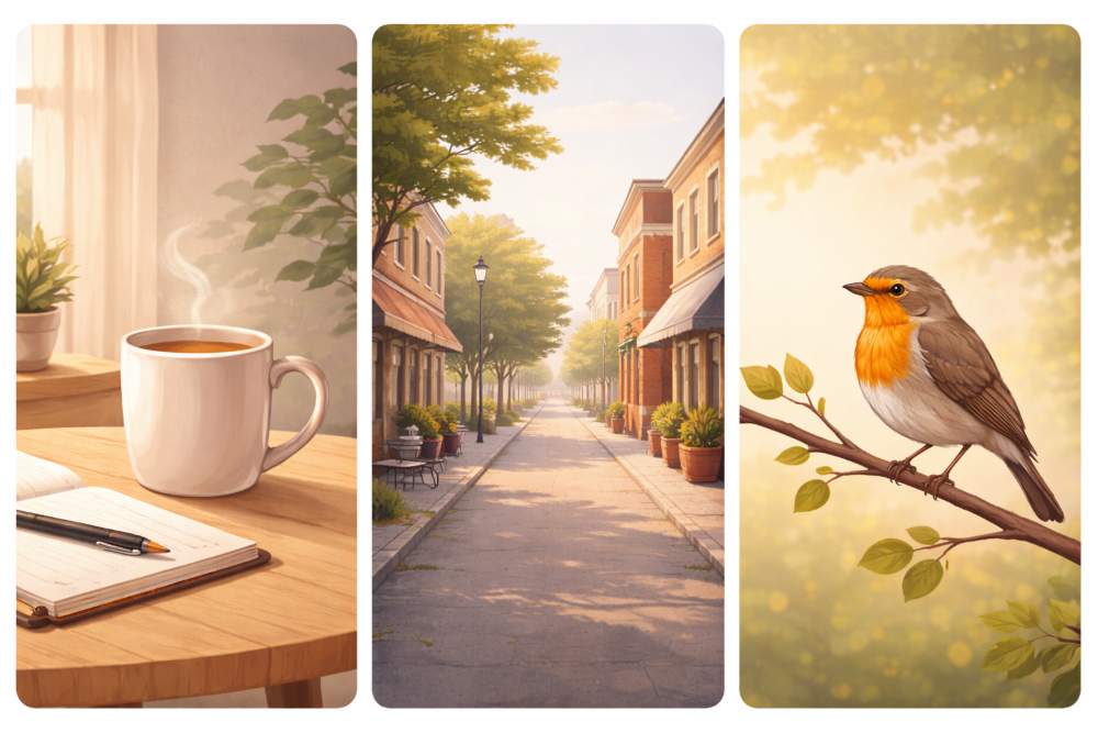
A coffee mug.
A city street.
A bird.
A human portrait.
Different subjects.
Same visual language.
9.2 Why Inconsistency Is the #1 Beginner Problem
Beginners usually do this:
- One image is flat illustration
- Next image is hyper-realistic
- Next image is dark and moody
- Next image is bright and playful
Each image alone looks fine.
Together, they look chaotic.
Readers notice this subconsciously.
They trust consistent visuals more.
9.3 The Style Anchor (Your Most Important Control)
Your style anchor is one sentence you reuse everywhere.
This sentence never changes.
Example style anchors
- “Flat digital illustration style, clean lines, editorial look”
- “Soft painterly illustration, gentle colors, calm mood”
- “Minimal realistic photo style, soft natural light”
Once chosen, do not rewrite it.
Copy-paste it.
9.4 Color Consistency (Limit Your Palette)
Too many colors break identity.
Pick:
- 2 main colors
- 1 accent color
Use them everywhere.
Example
- Blue
- Grey
- Soft yellow accent
Do not describe ten colors.
That creates noise.
Prompt example
“Limited blue and grey color palette with a soft yellow accent.”
9.5 Mood Consistency (Emotion Is Part of Brand)
Mood is often forgotten.
But mood is what people feel first.
Choose one dominant mood:
- Calm
- Thoughtful
- Playful
- Serious
Do not mix moods randomly.
Bad:
- Calm image → aggressive image → cheerful image
Good:
- Calm → calm → calm
Prompt example
“Calm, thoughtful mood with gentle energy.”
9.6 Lighting Consistency (The Invisible Glue)
Lighting ties images together even when subjects differ.
Choose one:
- Soft natural light
- Warm indoor light
- Neutral daylight
Avoid switching between:
- Dark cinematic
- Harsh contrast
- Bright flat light
Prompt example
“Soft natural lighting with gentle shadows.”
This line alone improves cohesion.
9.7 Composition Rules (Repeat the Same Framing)
Consistency also comes from where the subject sits.
Decide:
- Centered
- Slightly off-center
- Wide with empty space
Then reuse it.
Example
- Blog headers → subject slightly off-center
- Social posts → centered
9.8 Using Random Subjects Without Breaking Brand
This is where most people fail.
Let’s use random subjects:
- A bicycle
- A cat
- A book
- A mountain
If style, color, mood, and lighting stay the same,
these images will still feel connected.
Prompt pattern
“A [subject], flat digital illustration style, limited blue-grey palette, soft natural lighting, calm editorial mood, clean background.”
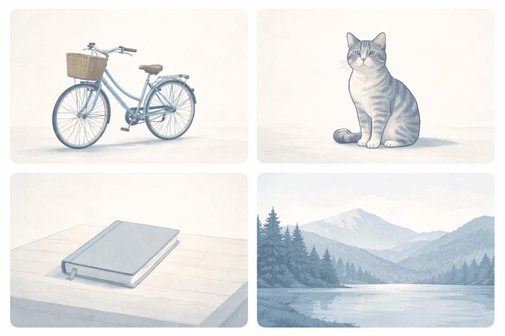
Only SUBJECT changes. That is brand control.
9.9 Character Consistency (When People Are Involved)
If your brand uses people:
- Describe them the same way every time
Include:
- Age range
- Hair style
- Clothing tone
- Expression
Example
“Young adult with short dark hair, neutral clothing, calm expression.”
Reuse this description.
Do not rely on memory. Text is your memory.
9.10 Style Locking (Advanced Beginner Technique)
Once you find a combination that works:
- Save it
- Reuse it
Create a style lock block like this:
“Flat digital illustration style, clean lines, limited blue-grey palette, soft natural lighting, calm editorial mood, minimal background.”
Paste this into every prompt.
This is how creators scale visuals fast.
9.11 Consistency Across Platforms (Blog, Social, Thumbnails)
Your style can stay the same.
Only the aspect ratio changes.
- Blog → wide
- Social → square
- Reels → vertical
Do not reinvent style per platform.
That breaks identity.
9.12 Common Consistency Killers (Avoid These)
Avoid:
- Changing style mid-article
- Experimenting inside a live post
- Letting “one cool image” break the system
- Copying styles from different creators
Experiment in drafts.
Publish consistently.
9.13 Simple Brand Consistency Checklist
Before generating, ask:
- Am I using my style anchor?
- Am I using my color palette?
- Is the mood consistent?
- Is lighting familiar?
- Does this belong on my site?
If yes, generate.
If no, fix first.
9.14 Why This Matters More Than Perfect Images
Perfect images do not build brands.
Consistent images do.
People remember:
- Tone
- Feel
- Rhythm
Not details.
Consistency builds recognition.
Recognition builds trust.
9.15 Key Takeaways from Section 9
- Brand consistency is a visual discipline
- Style anchors prevent randomness
- Colour, mood, and lighting matter more than subject
- Random subjects can still feel connected
- Reuse what works
Once you control consistency, flat Illustration image generation becomes a system, not a gamble.
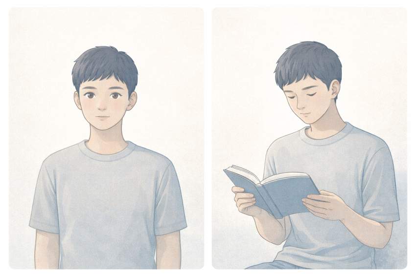
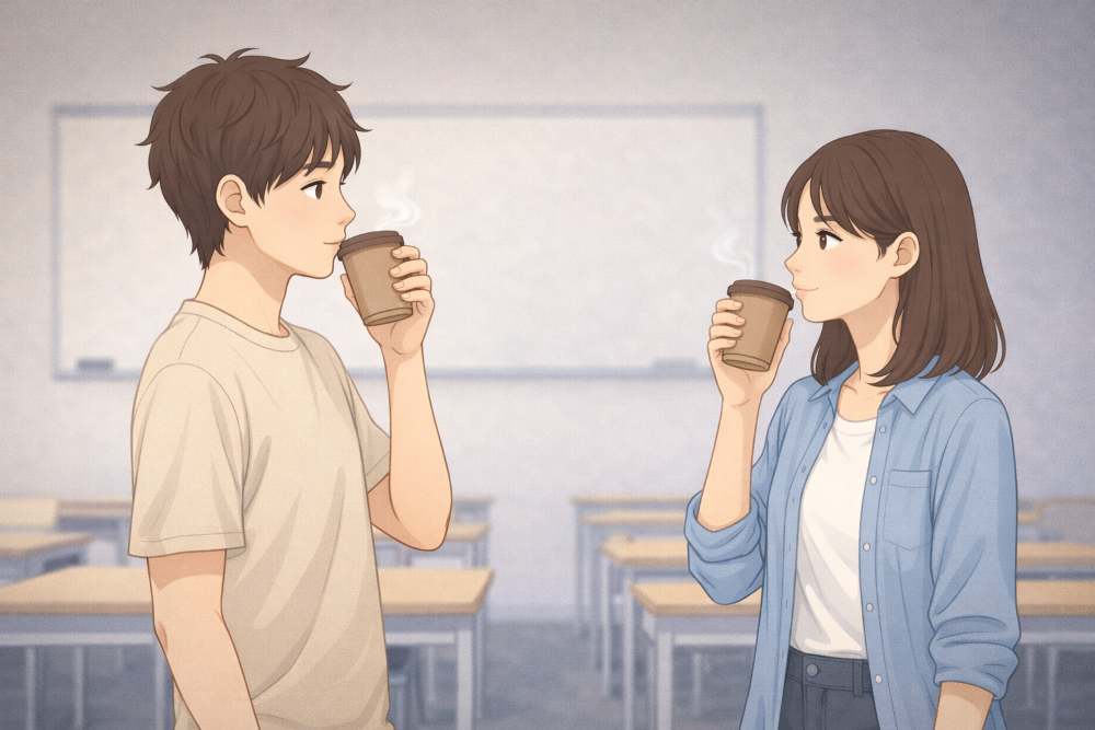
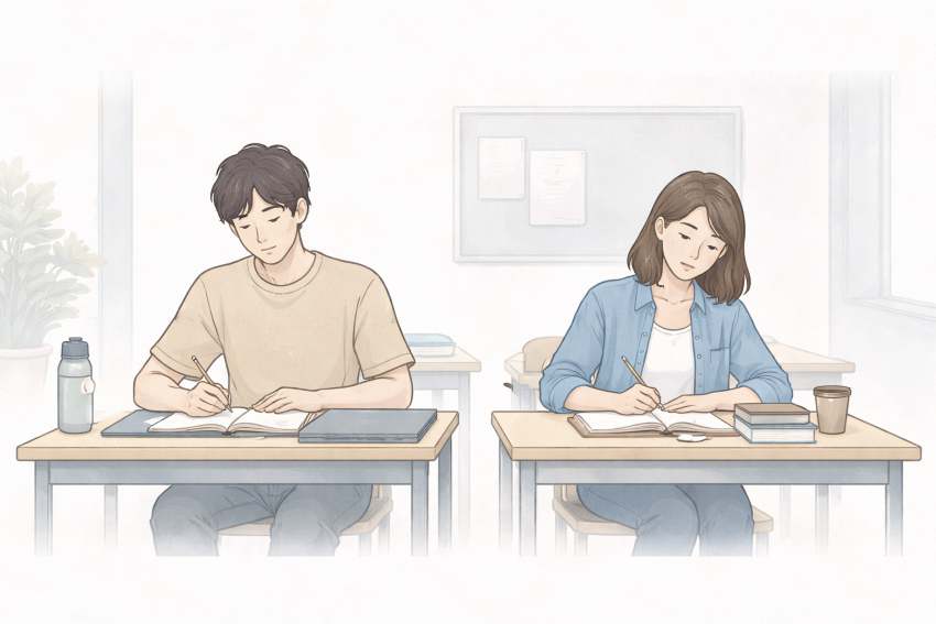
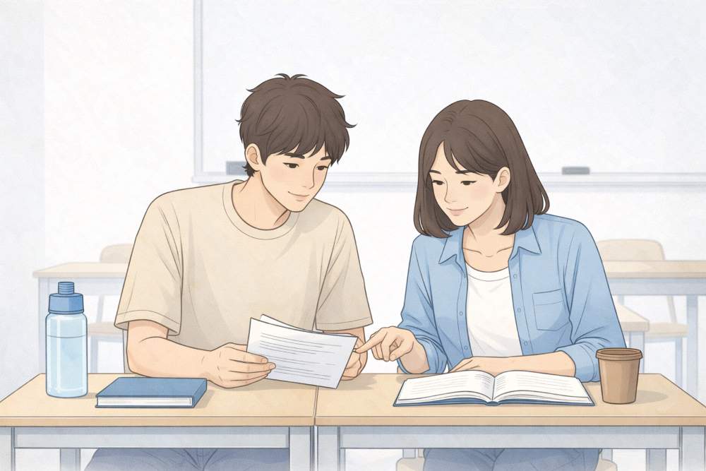
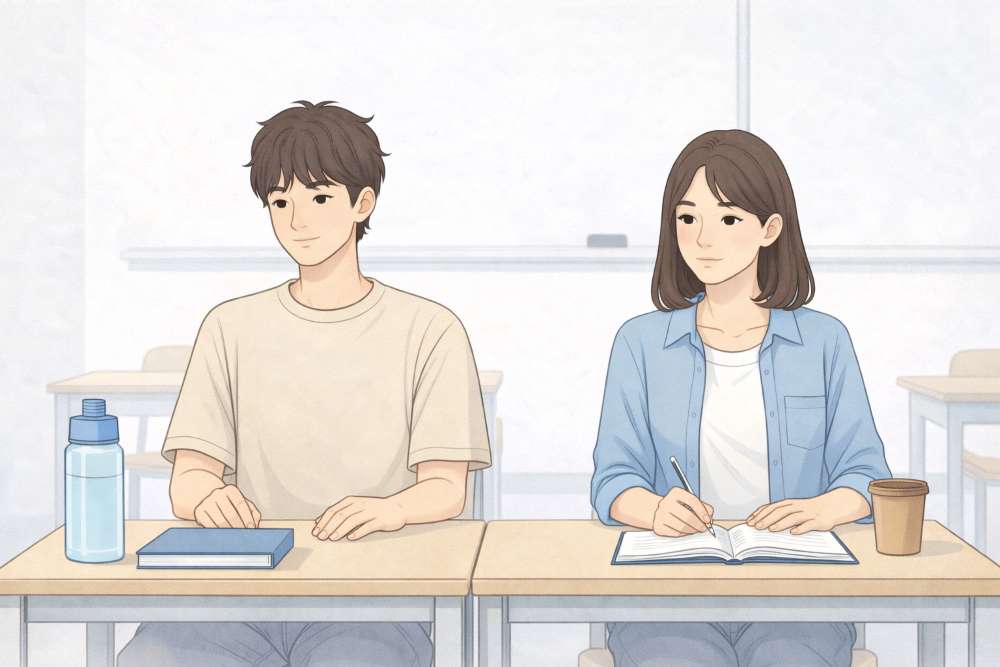
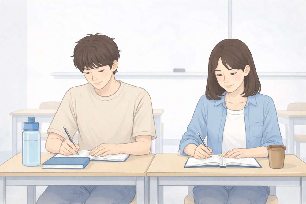
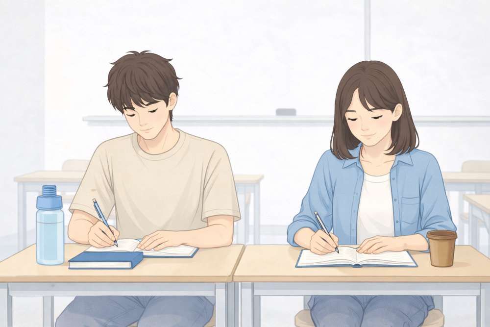
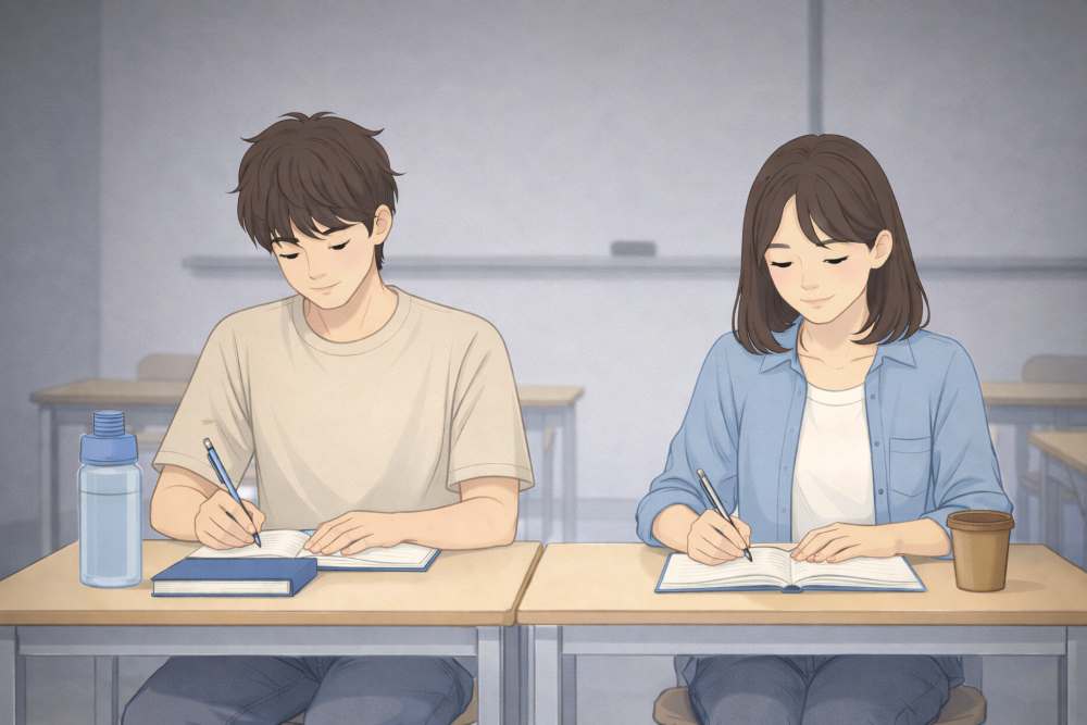
10. Advanced Image Prompt Techniques (Male & Female, Age 20, Classroom)
By now, you know how to:
- Write clear prompts
- Control style and mood
- Iterate without chaos
- Maintain consistency
This section goes one level deeper.
Advanced prompt techniques are not about complexity.
They are about precision and control.
We will use the same two subjects throughout:
- One male, age 20
- One female, age 20
- Classroom setting
Only techniques will change.
10.1 Advanced Prompting Is About Reducing Guesswork
Beginners describe what they want.
Advanced users describe what matters most.
This means:
- Clear priority
- Clear constraints
- Clear exclusions
Bad advanced prompt:
“A realistic detailed emotional classroom scene with students learning deeply.”
Too vague.
Good advanced prompt:
“Male and female students, age 20, sitting at desks in a classroom, flat digital illustration style, calm focused mood, soft indoor lighting, clean academic environment.”
Control comes from specificity.
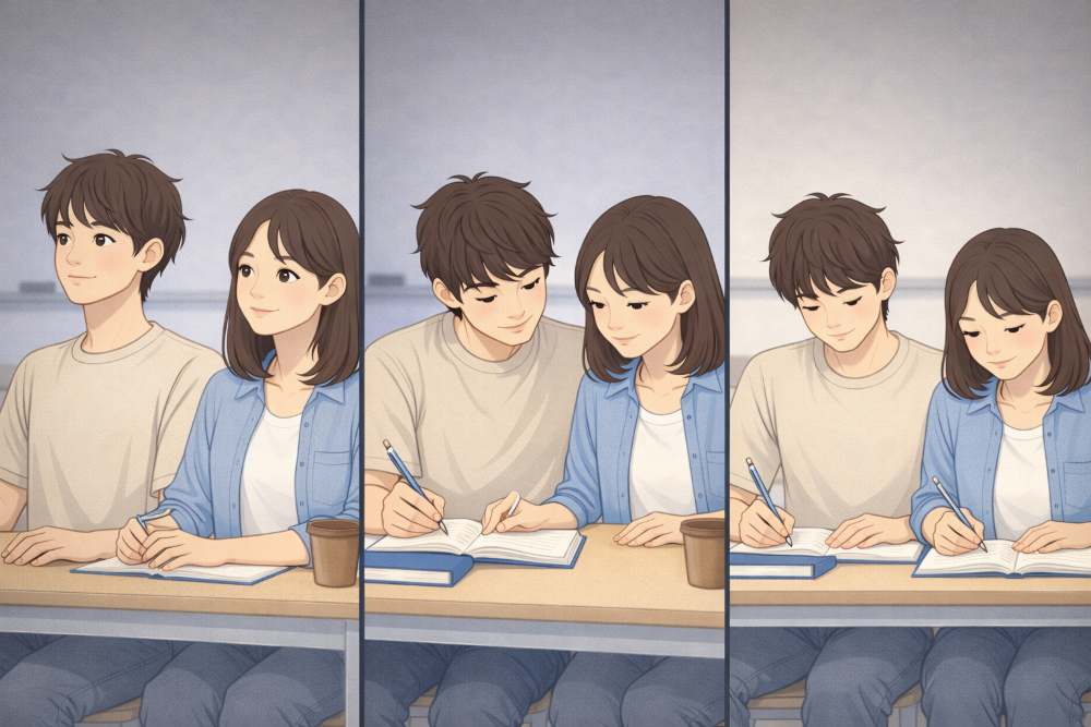
10.2 Subject Locking (Keep Characters Consistent)
Subject locking means describing people the same way every time.
This is essential for:
- Series content
- Educational blogs
- Visual storytelling
Subject lock block (example)
“Male and female students, both around age 20, casual modern clothing, neutral expressions, realistic proportions.”
This block stays unchanged.
Only actions change.
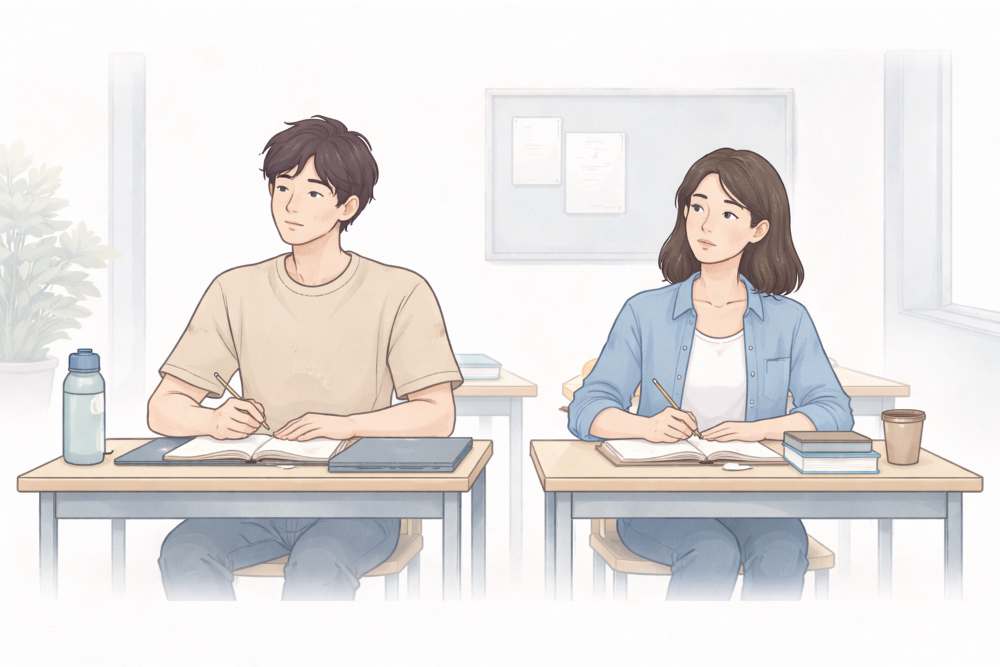
Example
- Sitting and listening
- Discussing together
- Writing notes
10.3 Action-Focused Prompting (Control the Scene)
Once subjects are locked, control comes from verbs.
Verbs define the image.
Weak verbs:
- Standing
- Sitting
Strong verbs:
- Discussing
- Writing
- Listening attentively
- Explaining
Example prompts
“Male and female students discussing quietly at their desks in a classroom…”
“Male and female students writing notes while listening in a classroom…”
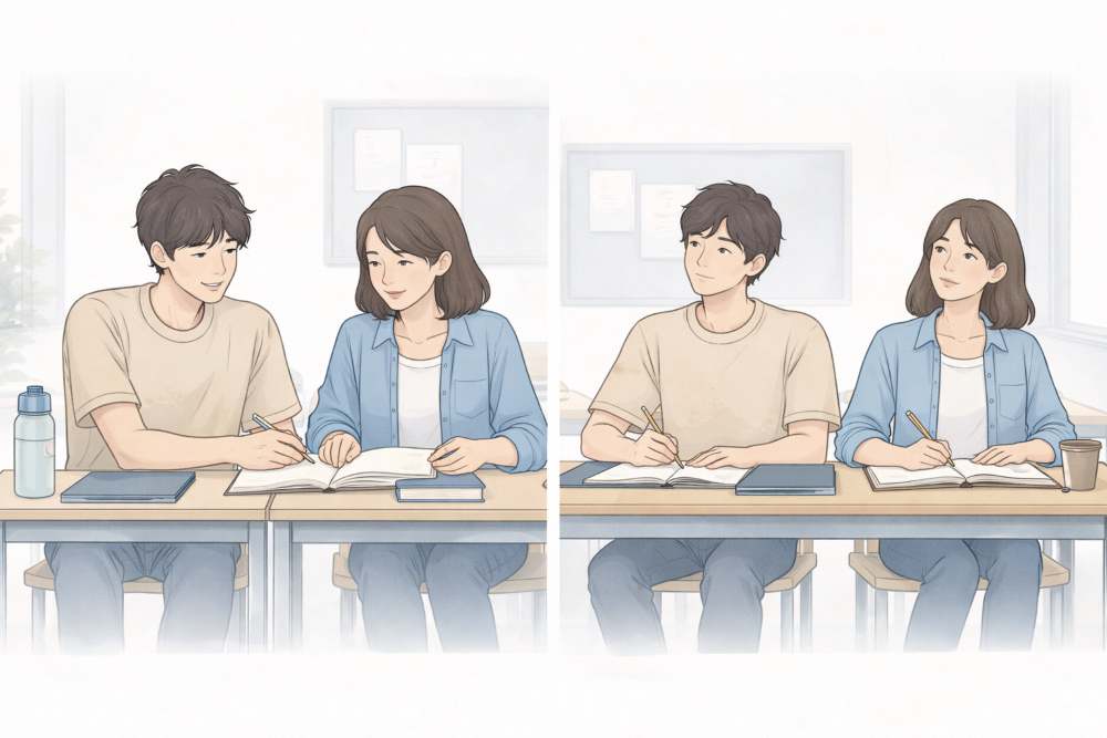
Same people. Different story.
10.4 Background Anchoring (Classroom Without Noise)
Advanced prompting avoids background overload.
A classroom does not need:
- Posters everywhere
- Other students crowding
- Complex architecture
Use background anchors:
- Whiteboard
- Desks
- Soft daylight
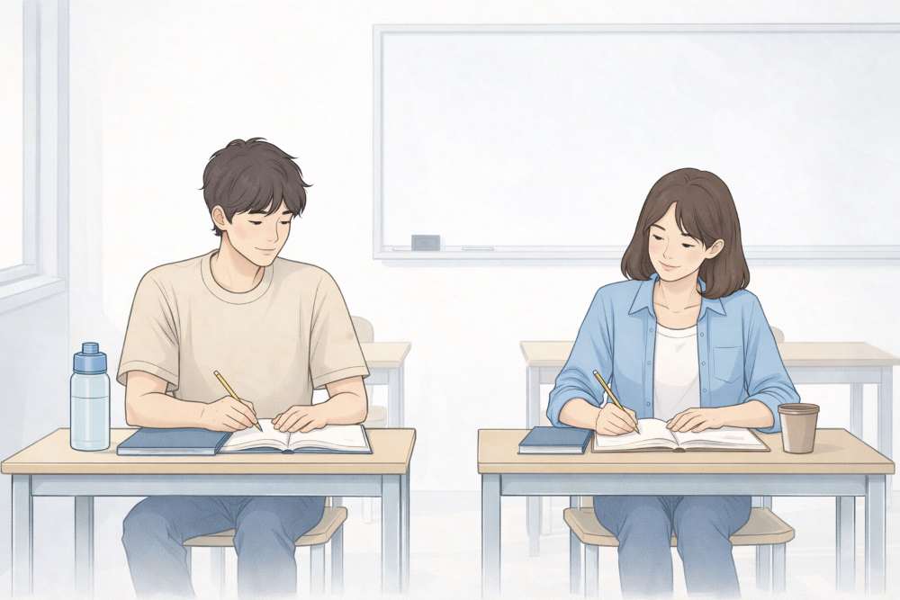
Background anchor example
“Clean classroom interior with desks and a whiteboard, no clutter, academic atmosphere.”
This keeps focus on subjects.
10.5 Priority Stacking (What Matters Most Comes First)
Advanced prompts stack priorities in order.
Correct order
- Subjects
- Action
- Style
- Mood
- Lighting
- Background
Example
“Male and female students, age 20, discussing notes together, flat digital illustration style, calm focused mood, soft indoor lighting, clean classroom background.”
Do not hide the main idea at the end.
10.6 Negative Prompting (Say What You Do NOT Want)
This is an advanced but powerful technique.
Negative prompts reduce errors.
Common classroom negatives
- No cartoon exaggeration
- No fantasy elements
- No dramatic lighting
- No crowded background
Example
“No exaggerated expressions, no fantasy elements, no cluttered classroom, no dramatic shadows.”
This improves realism and clarity.
10.7 Controlled Emotion (Advanced Mood Handling)
Advanced users control emotion intensity.
Instead of:
“Happy mood”
Use:
“Subtle positive academic mood, focused and calm.”
This avoids:
- Over-smiling
- Unreal expressions
For classrooms, subtlety works best.
10.8 Perspective Control (Camera Awareness)
Perspective changes authority and meaning.
Common perspectives:
- Eye-level → neutral
- Slight angle → dynamic
- Wide shot → environment focus
Example
“Eye-level view of male and female students seated at desks…”
Avoid random angles unless intentional.
10.9 Advanced Iteration Technique: Micro-Edits
Advanced iteration means micro-changes.
Do not say:
“Make it better.”
Say:
- “Reduce background brightness slightly.”
- “Increase focus on the two students.”
- “Soften facial expressions.”
Each edit targets one variable.
This is professional control.
10.10 Scene Continuity (Multiple Images, One Story)
Advanced creators often need a sequence.
Example sequence:
- Students listening
- Students discussing
- Students writing
Base continuity prompt
“Same male and female students, age 20, same classroom setting, same illustration style…”
Only actions change.
This creates visual storytelling.
10.11 Advanced Style Lock for Educational Content
For classroom visuals, a safe advanced style lock is:
“Flat digital illustration style, clean academic look, soft natural indoor lighting, calm focused mood, minimal classroom background.”
Use this everywhere.
Do not experiment mid-article.
10.12 Common Advanced Mistakes (Avoid These)
Even advanced users fail when they:
- Over-direct every detail
- Stack too many actions
- Mix emotional tones
- Forget the audience
Remember:
Advanced prompting is clarity, not control obsession.
10.13 Why This Matters for Serious Content
Classroom imagery is sensitive.
Over-stylized images:
- Break credibility
Under-defined images:
- Feel generic
Advanced prompting keeps visuals:
- Neutral
- Informative
- Trustworthy
This matters for:
- Education blogs
- Explainers
- Serious commentary
10.14 Key Takeaways from Section 10
- Advanced prompts prioritise, not decorate
- Lock subjects early
- Use verbs to control scenes
- Anchor backgrounds
- Use negative prompts wisely
- Iterate with micro-changes
- Maintain continuity across images
At this stage, image generation stops being a tool.
It becomes a controlled system.
Final Conclusion: From Random Images to a Controlled System
If you remember only one thing from this guide, remember this:
Generating a flat illustration image is not art magic.
It is a system.
At the beginning, images feel random.
By the end, they feel intentional.
That change does not come from better tools.
It comes from better control.
Throughout this guide, you learned that the subject does not matter as much as the structure.
We proved this by using many different subjects:
- A blogger at a desk
- Buddha in meditation
- A peacock in an aesthetic garden
- A cute cat in a clean room
- A dog and a cat in a modern indoor garden
- A cute lion in the savanna
- Random objects, animals, people, and places
- Male and female students (age 20) in a classroom
Different subjects.
Same principles.
That is the real lesson.
Once you understand:
- prompt structure
- iteration
- style locking
- aspect ratios
- brand consistency
- advanced control
You can generate ANY IMAGE with confidence.
You stop hoping for good results.
You start engineering them.
At that point, Flat Illustration becomes:
- faster
- repeatable
- scalable
And most importantly: PUBLISHABLE.
The Master Cheat-Sheet (Save This)
Use this section as a quick reference every time you generate images.
1. The Universal Prompt Formula
Always follow this order:
Subject
→ Action (if any)
→ Style
→ Mood
→ Lighting
→ Background
→ Optional negatives
Example
“Cute lion sitting calmly in the savanna, flat digital illustration style, calm friendly mood, soft warm sunlight, clean open background, no clutter.”
2. Subject Control (Who or What)
Ask:
- What is the main subject?
- Should it be cute, neutral, calm, or serious?
Examples used in this guide:
- Blogger working
- Buddha meditating
- Peacock posing
- Cat relaxing
- A dog and a cat interacting
- Lion sitting, standing, lying
- Students studying
Rule:
One clear subject is better than three vague ones.
3. Style Lock (Non-Negotiable)
Pick one style and reuse it everywhere.
Examples:
- Flat digital illustration
- Minimal editorial illustration
- Soft painterly illustration
Once chosen:
Copy–paste it into every prompt.
This is how consistency is built.
4. Mood Control (Emotion Matters)
Choose one dominant mood:
- Calm
- Peaceful
- Playful
- Focused
- Thoughtful
Do not mix moods randomly.
Examples:
- Buddha → calm, serene
- Classroom → focused, neutral
- Animals → gentle, friendly
5. Lighting Control (Invisible Quality Boost)
Lighting decides professionalism.
Safe defaults:
- Soft natural light
- Warm ambient light
- Gentle shadows
Avoid:
- “Normal lighting”
- Harsh contrast unless intentional
6. Background Discipline
Less background = more focus.
Good backgrounds:
- Clean room
- Open savanna
- Simple garden
- Minimal classroom
Bad backgrounds:
- Too many objects
- Too many symbols
- Visual noise
7. Aspect Ratio Rules (Decide First)
- 16:9 → blogs, headers, thumbnails
- 1:1 → social posts
- 9:16 → reels, shorts
Match pose to ratio:
- Wide → lying, relaxed poses
- Square → seated, centered poses
- Vertical → standing, stretching poses
8. Iteration Rule (Golden Rule)
Change only ONE thing at a time.
Correct order:
- Fix lighting
- Fix mood
- Fix pose
- Simplify background
Never change everything at once.
9. Brand Consistency System
Your images belong together if these stay consistent:
- Style
- Color palette
- Mood
- Lighting
- Composition
Subjects can change freely.
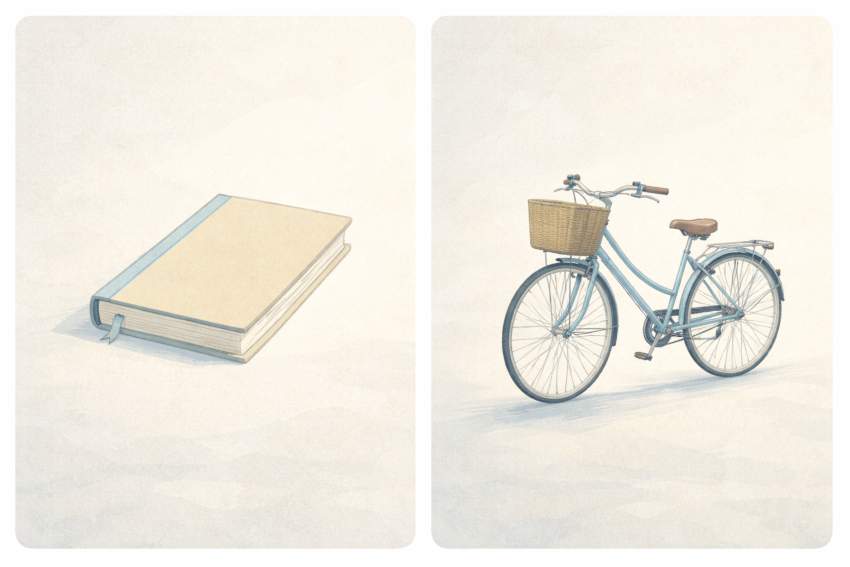
A cat, a book, a bicycle, a mountain
can all look like the same “brand”
If the system stays intact.
10. Advanced Control Checklist
Before generating, ask:
- Is my subject locked?
- Is my style copied rather than rewritten?
- Is the mood intentional?
- Is lighting specified?
- Is the background clean?
- Do I need negative prompts?
If yes → generate.
If no → fix first.
11. One-Line Master Prompt Template
Use this everywhere:
“[Subject + action], flat digital illustration style, calm editorial mood, soft natural lighting, clean minimal background, [optional negatives].”
Swap only the subject and action.
12. Final Mindset Shift
Do not ask:
“Will this image be good?”
Ask:
“Does this image serve the content?”
If it:
- supports the article
- matches the tone
- fits the layout
It is successful.
Consistency beats perfection.
Clarity beats cleverness.
Systems beat luck.
You now have a complete operating manual for Flat Illustration using ChatGPT.
Save this guide by bookmarking it and follow my profile on X for more upcoming authentic GUIDES!